
#colourofthemonth: CORAL BLUSH 🦩
- Laura Antoni

- Jul 6, 2020
- 4 min read

'a moderate yellowish pink that is redder, lighter, and stronger than dusty pink, redder and darker than peach pink, and redder and deeper than average peach'
Comprised of pink tones and orange shades, coral is a unique combination of these vivid hues. Though it has pink undertones, coral is most commonly associated with the color orange. Its roots date back to the 16th century, which emphasizes coral’s timeless elegance. This hue gets its name from bottom-dwelling reef fish and was popularized by Egyptians and Romans. These ancient figures wore coral jewelry in the hopes of resisting evil and temptation.
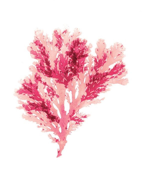
Coral pink is a variant of orange and is representative of the shades found in cnidarians, which are more commonly known as precious corals. The first recorded use of the term coral as a color comes from 1513 England. Being a natural color, coral pink is composed of various hues. It is mostly red, but contains green, blue, magenta, yellow, and black as well.


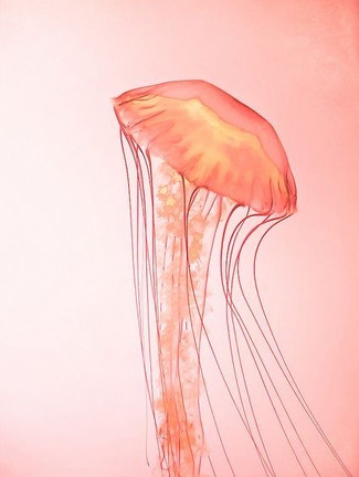


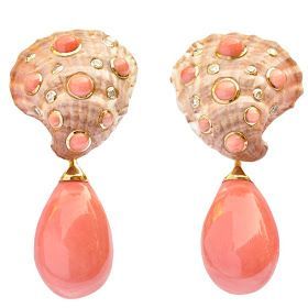
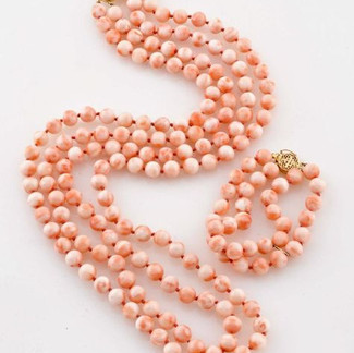
Coral’s name is sourced from the marine invertebrates that populate tropical seabeds. Specifically, the color is named for the intensely colored red or pink-orange skeleton of precious coral, which was traditionally used to make jewelry.
Coral is thought to bring comfort and peace of mind. During the Renaissance, coral amulets were worn to safeguard against harm. For optimal protection, many would wear coral jewelry around their neck. Some paintings even included images of baby Jesus wearing coral jewels. With that said, it was also a holy color.
Alongside its connection to exotic environments, coral also has links to spirituality and is an important color in both Hinduism and Buddhism. A red shade of coral was recorded as being representative of the Muladhara Chakra in Hindu philosophy. The color is associated with roots and the Earth, and represents the spot where Kundalini energy sits in the spine.


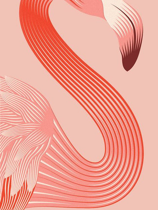
Coral is, for most people, perceived as a largely positive color. Warm, dynamic, and invigorating, it blends the femininity of pink with the optimism and energy of orange. Corals with more red tones are particularly strong and vibrant, and can be used successfully in masculine schemes.
Because coral blends three warm colors—orange, pink and red—it is an overwhelmingly friendly, open and emotionally intelligent color. It also manages to shed the historical baggage of all three colors—while red can be aggressive, pink girlish, and orange mass-market, coral manages to forge a unique identity which is inclusive and revitalizing.
Coral often throws logic to the wind. Rather than rely on its senses, coral goes with gut instinct. This can be beneficial in some situations, but it’s ultimately irresponsible. It’s for this reason why coral is perceived as childish. Coral is so confident that it would rather depend on its sixth sense than practicality.
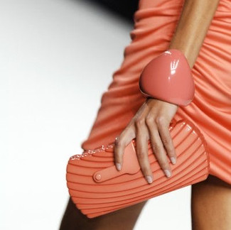
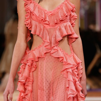
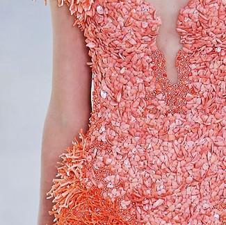
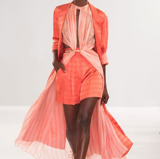
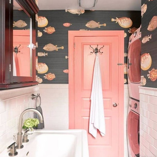
Current trends and styles typically feature the color coral. This hue never loses appeal, which is why it has stood the test of time. In interior design, coral is especially popular. Fashionistas regard coral as a hip color. This bright hue pairs nicely with an assortment of shades, making it both a dominant and complementary color. Best of all, you can dress it up and down.
In the 1970s a taste for all things orange and pink led to coral shades being used liberally across interior design, fashion and beauty. Stars of the disco era popularized coral-shaded cosmetics, with lips, eyes, and nails adorned in shades of orange-pink. The color pink coral works well with many skin tones, suggesting a love for the natural look. Those who go for the natural looking appearance probably have a desire for the natural in other areas of their life as well


Today, coral continues to be a popular color for beauty products. It is believed to give the wearer a warm, flattering glow, mimicking the natural healthy flush resulting from outdoor exercise.Although the beauty industry has been the traditional home for coral, designers, photographers, and illustrators are starting to explore coral’s diverse potential as a color for branding, advertising, print, and interior design. Because coral is playful, inclusive, and contemporary, it makes the perfect color choice for trend-led branding projects.
Designers are starting to rediscover coral as a versatile, dynamic color that works seamlessly for a wide variety of projects.
Coral can be considered either gender-neutral or be intentionally gendered through the addition of more pink (to create a feminine coral) or more orange and red (to create a masculine tone), making it a versatile color for fashion design.
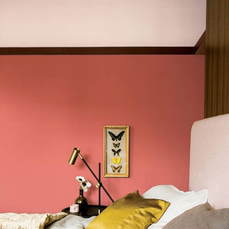
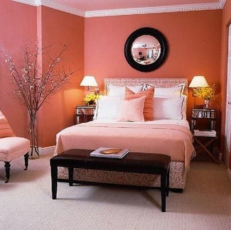
Coral is a naturally feminine color. Because of this, you can use it to feminize just about any space. To create a more sophisticated atmosphere, offset your coral pieces with walls of navy blue and metallic fixtures. All metals work well with coral, so don't be hesitant to use gold, silver, bronze, or brush nickel. When you use light grays, whites, blacks and coral pink in a space, you will get a traditionally girly feel. This combination looks best in girls' rooms. Use coral pink with navy and white for a more subdued yet still girlish appearance.
Coral pink doesn't always have to be so feminine. When you use the hue sparingly in a room with mostly grays and whites; teal and ivory; or cognac, slate, and taupe, you can create a look that any person would be happy to relax in. When used sparingly, coral pink can create just the right amount of visual drama without being overbearing.

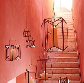


The coral color is one of those colors that never seem to go out of style. It works well with each season, it looks equally as good outdoors and indoors, and it gives a lovely warm and cheerful feel to every room where you can find it.
From coral accents to coral walls, this is a color that always freshens up a space and kind of wakes it up.Coral red color goes well with neutrals so if you get bored with your all-white room, all you have to do is simply add a few coral accessories and give them room a bit more life. However, while you may combine coral with all kinds of colors, such as shades of grey, blue, beige etc., sometimes, the best way or celebrating coral is by adding different layers with similar tones such as raspberry, rosy, and similar. Coral combined with pink hues create a soft and romantic environment that you will enjoy spending your days in.


Comments