
#colourofthemonth: CLARET RED 🍷
- Laura Antoni

- Nov 2, 2020
- 3 min read

...a new month, a new colour...
Colorstrology in partnership with Pantone, Inc has created a colour palette for every month and every date within the month. They are designed to help you understand your personality and "numerological" significance for your special date. Every month and date has a unique colour just as every person is unique.

The colour for November is Claret Red. Claret Red is a colour that inspires passion and strength. People born in November are perceptive. Surrounding ourselves with Claret Red will help increase your ambitions and persistence.


The claret red colour is a dark shade of red. It can be obtained with a mixture of black and red. It is mostly used in autumn and winter and has many shades, either close to red (light shade), or close to black (dark shade). This colour, which is used frequently in women's clothing, is a noble colour as well as black and royal purple and represents nobility. This colour is also used with the same meaning in the decoration field as well. It is a different and impressive selection that can be used anywhere in our house, from light tones to dark tones.
Claret red, a type of colour belonging to the dark colour group, can be used in combination with light colours. This gives it a warmer and more inviting colour than other dark colours. It has positive effects on human psychology with this feature.
This colour provides psychological self-confidence. It’s a colour that is preferred to be used in leadership in the business world. Especially for women, the use of claret red on one piece of clothing and shoes creates a strong image.


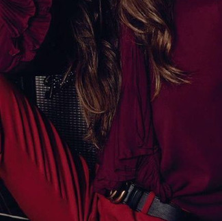


The claret red colour, which is used frequently in women's clothing, is a noble colour like black and represents nobility. It can be combined with many colours to create a beautiful fashion style. Some beautiful colours that suits are; black, cream, beige and light powder tones.
This colour is popular amongst women especially in cosmetics. It’s commonly used in autumn and winter as a rouge.

Claret Red inspired a lot of artists in different fields of design. Interior designers loved incorporating this colour in their designs no matter of the style. It's really interesting to see such a bold and unique colour, associated and understood in so many creative ways.


"This leans more towards an orange-red versus a blue-toned red. It reminds me of my favourite lipstick. It is sexy but also earthy. This colour is fabulous for a statement piece of furniture (try it on a kitchen island!)." — Taniya Nayak
“We’re drawn to the earthy and contemporary hue of this colour. It has just enough brown undertones to work well with almost any warm-toned neutral. It’s perfect for a small space, like a powder room, that needs to pack a punch.” — Jean Liu
“This classic shade of crimson reminds me of the glamorous 1970s and feels inspired by mid-20th century artists like Rothko and Motherwell. I’ve recently used it in the interior of a credenza for a surprising contrast to an otherwise conventional piece.” — Patrick Ediger
I would use this red in a dining room mixed with an antique mirror, gilded furniture, and a rock crystal chandelier. It is sophisticated and luxurious." — Alex Papachristidis
This red looks amazing with warm woods like teak and walnut, so it's the perfect compliment to a mid century aesthetic: rich, yet calming and elegant." — Alec Holland
"It's a stately rich, bluish red that has just enough blue in it so that it whispers colour, rather than shouts. It's a comfy, liveable red that is perfect for any room of the house." — Elaine Griffin


https://pinterest.com


Comments